A modern identity, consistent everywhere.
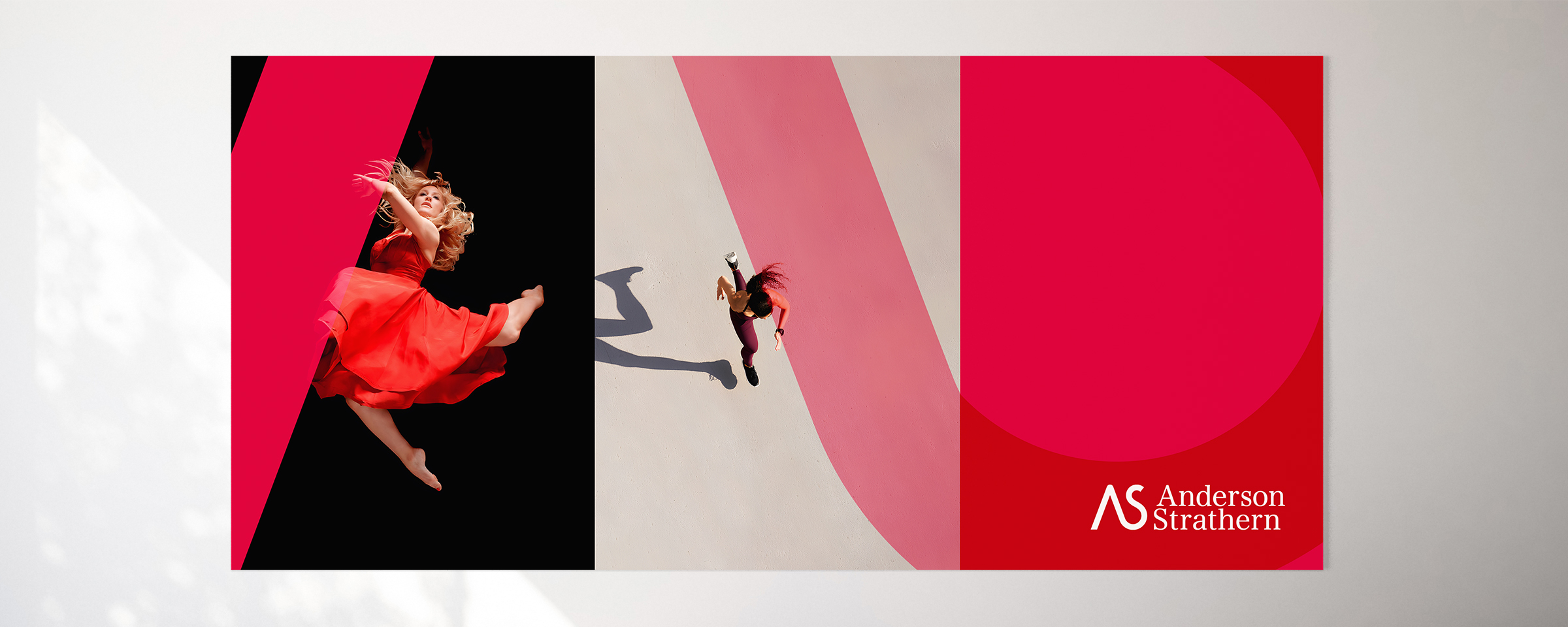
Anderson Strathern is a progressive, ambitious business, and one of Scotland's leading law firms. But its visual identity no longer reflected the organisation it had grown into.
It needed a brand that could keep pace with its evolution, and the control to use it consistently, everywhere.
Honour the heritage. Show the ambition.
The firm wanted a visual identity that honoured its heritage while expressing a modern outlook, and a system that could be applied consistently across every office, department and communication.
So the challenge wasn't a simple brand refresh. It was to create a visual identity people would be proud to use, and to give the business the control to present one clear, confident face in all environments.
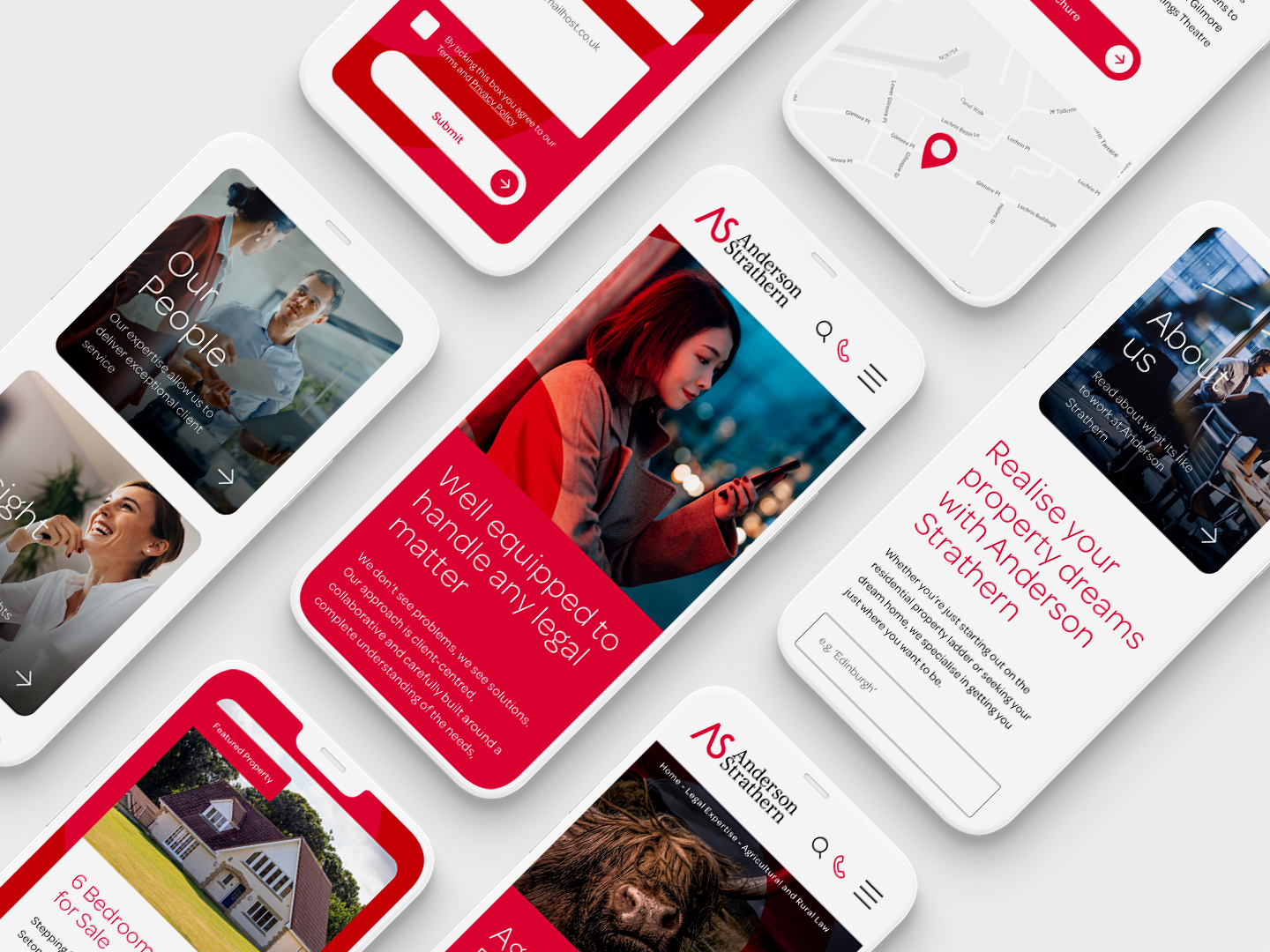
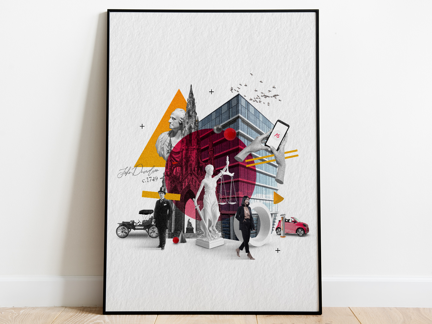
A brand with the creativity to stand out, and the control to stay consistent.
Built on values. Rooted in place.
The strategic direction was shaped with careful consideration of what Anderson Strathern stands for, as well as its ambitious vision for the future. From this, a bold new visual identity was developed, rooted in the firm's character and inspired by its Edinburgh and Glasgow heritage. At the heart of the system sat a distinctive triptych storytelling approach, supported by a flexible brand supergraphic and a suite of bespoke illustrations celebrating the firm's historic locations.
Each element was carefully defined, including typography, colour, photography and digital applications, as well as presentations, marketing materials and office environments. Comprehensive brand guidelines then turned those individual assets into a practical design system: easy for teams to use, and consistent across every touchpoint.

Creativity, with control built in.
The result was far more than a refreshed identity. Anderson Strathern gained a scalable brand system that balanced creativity with control, allowing the business to communicate with greater confidence, clarity and consistency.
By pairing distinctive creative assets with clear governance, the new identity gave teams the tools to produce work that always felt recognisably Anderson Strathern. The firm now has a brand that reflects its progressive ambitions, celebrates its heritage, and protects the quality and value of its reputation as it continues to grow.
“We needed expert help to bring our strategy, positioning and values to life. The team creatively nailed it first time and perfectly reflected what we were trying to achieve. They feel like an extension of our internal marketing team, all pulling in the same direction. ”
Marketing and Business Development Director, Anderson Strathern
Bespoke illustration
Design system
Brand guidelines
Edinburgh & Glasgow
More selected work.
Explore the programmes